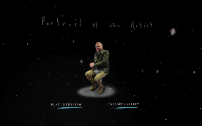
In addition to a Making Of Video, we wanted to create a teaser trailer to give people a taste of what is to come, and encourage people to view it at the end of year show. After collecting the footage from Rachel and creating numerous screen recordings from our work, I was able to begin working on this.
The goal of this piece was to showcase our work, not necessarily showcase the process or the team. For this reason, I kept the edit short and snappy with hints of all the areas of our piece through it.
Bloom by Odesza sets the pacing of the piece, and adds to an energetic and exciting edit. View the final cut below:
After our first public display with the senior university staff and Princess Anne, we had learnt a lot which really helped us when thinking about preparing for the the end of year show. We had decided together that in addition to the Oculus build, creating a trailer video and a “making of” video would be effective outputs to showcase our project. The reasons for this decision came on the back of research into Kickstarter type videos, as well as experiencing first hand how the public interacted with our piece, when showcasing for Princess Anne.
Insights
I’m going to highlight a few of our findings regarding the general display of the piece, when in a large room with many people from the University Opening .
It gets very loud
Many people don’t get to try on the Oculus
This is self explanatory, but worth noting. We know that the degree show will have this same atmosphere, but on steroids. In our piece, the fully immersive experience only happens when wearing headphones. In addition to that, with our experience being three minutes, there will be a limit to the number of people who will be able to try the headset. We know the degree show will be packed, so in planning for that, we feel that we should create an accompanying video to play on loop, to give passers by an idea of what is going on in the headset, even if they don’t try it themselves.
The Unity master scene recordings are hard to get high quality
I have been gathering content for the edits I’m doing, and one potential problem that has arisen is that I can’t get a high quality screen recording of our video. The piece is no where near as effective when viewed on the PC monitor instead of the headset, and it also lost considerable quality upon playback, when recorded from Unity on the master scene. I have already done some Unity recordings on other machines, and the quality works well, but on our master it does not come out sharp. This is something that I hope we can investigate to fix, otherwise, we’ll need to build the scenes separately on the other machines, to fake it for our video.
Next Steps
Over the next week, I’m going to be working towards building a trailer video and a “making of”. As I work to get the videos and edits done I will strive to figure out a way to get everything to its highest quality, so that each person who passes our table, wether they try on the headset or not, has a positive experience.
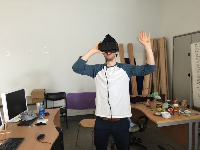
This week we pushed hard to get another build together with as much progress as possible for the presentation. We projected the piece on the wall, with Nicole demonstrating the experience in the Oculus.
Planning
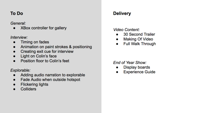
After creating this build, we made a list of the major things we still were planning on editing within the experience.
User Testing
In addition to these plans, we wanted to get as much feedback on the experience as possible, so we got the whole class to test it. I did observational research, not giving any instruction, and merely watching how people responded to the piece.
FeedBack and Iterations
While Nicole and I observed, Fiona gathered comments from people after they had tried the experience out. There were some great reactions, and a generally positive reaction. The constructive feedback helped to inform the next stage of the process.
Insights
People don’t look around enough
-In light of this we have decided to edit the paint strokes to guide the eye around the piece.
We have always had it in our minds to have accompanying audio clips to each sub exhibition in the gallery. These would contain narration from Colin’s wider interview, where he talks about the inspiration behind his work. We felt this would be impactful addition to the space and an effective way to give the participant extra information. As I learnt from my last research and testing (LINK), it’s difficult to read a lot of text in VR, so audio would be a better way to add this.
After spending a lot of time writing for the gallery and figuring out what the story of each section should be, I had an idea of how to approach this space. Fiona had taken a look at the clips, and quickly realised that it’d take a bit of time to curate the content for a number of reasons. Because I was already very involved in the content of the gallery, I took over to make the best use of our time.
Challenges
The main challenges with the content curation were to do with timing. After discussing it with the girls, we decided that each clip should be no more than 60 seconds. This meant that I was trying to summarise Colin speaking about years of his life’s work in 60 seconds.
Colin is a slow speaker and also has a stammer, so it took a lot of time to tightly edit a range of clips that cut out the in-between pauses.
The interview wasn’t conducted for this information. With the explorable gallery designed and created after we got our interview, we had never conducted the interview for it. It was originally only intended for the interview section of the piece. While we were lucky to have gain much more information than we needed for the interview, the content does not totally fit with what we have. This meant that I had to chop up a large range of pieces, not only to make them fit, but to make sense as a story.
Action
Always up for the editing challenge, I took myself into a quiet space with my headphones and gave the piece my attention. I made note of the goal of each piece before editing it, so that I was pulling the correct information out, and supporting the paintings that were on display.
This slideshow requires JavaScript.
You can see in the above images, that each 60 second clip has numerous cuts and edits. I had to jump between a number of sentences and clips to achieve a cohesive story. However, after a number of iterations, and tests, I finally got there. I feel that the motive of the sub-exhibitions come across in the edits well. You can hear them below.
After our build review together, one of the changes we decided to make was to change the turf scripts. There were two reasons for this:
The Seamus Heaney sequence was too cluttered with how they were animating. The current animation of the scripts brought all of the textures up at once, so it was hard to know what to look at.
We noticed from our user testing that people were not looking around the scene unless they were guided by the visuals. By making the animation of the turf slower, and more obvious, we could potentially teach the participant to look around more.
Turf Editing
Below is a video of the speed of the turf originally. It’s clear that it’s too fast, and each of the scripts on the mountain shape and turf are the same, so of course they are appearing together.
Staggered Timing and Separate Scripts
From my work with the celebrity heads, I was familiar with the process of script editing, and was able to apply the same process to the turf. I changed the approach slightly this time, and applied a different script for each texture, so that the animation of the turf would stagger as it moved around the scene. As they were all different models I was able to stagger them by a few seconds consecutively.
I also changed the timing of the mountain’s sweeping animation to be much slower, so that you could easily follow it as it appeared. In the last build, I remember only at times seeing it animate into the scene, because it was so so fast. The times I did notice it, it was really lovely effect, so we wanted to make sure that the participant gets the best out of the experience. You can see below the timing is much slower.
Editing Textures in Photoshop
I noticed that the turf shapes were coming in from the opposite direction to the sweeping mountain, so I decided to bring the textures into Photoshop to edit the direction of the gradient in the alpha channel.
While I was there, I changed the intensity of the animation so that the texture sweeps in, rather than the dispersed fizzle type animation that it was previously doing. To do this I brought the textures into Photoshop to change the alpha channels. I upped the threshold, so that there was a very clear gradient for the script to follow from one side to the next.
Finally I added packaged everything to be passed over to Nicole, making sure the naming matched the final scripts and textures.
Compiling In Unity
I passed everything on to Nicole, as we tested to see how the new scripts and textures would work. They came together really well, and there was a much more natural progression in the animation.
User Testing
When we tested it on real people, we noticed that they actually followed the strokes without being told to look around. This was a success, and a great proof of concept for us in VR. We’re learning that user really does need taught to look around, and by creating obvious animations like the sweeping mountain, it acts as a mini tutorial. This may be useful as we continue to develop the paint strokes.
One of the less sexy, but incredibly important parts of this whole process has been the pipeline between each of us as a team. From the beginning, we sat down and had a conversation about folder structure, file organisation, naming conventions and how to pass assets on to each other.
With the explorable, I have been working with the scene as a whole, so we decided instead of passing on many assets separately, that I would work independently on it until it was where it needed to be, and then package the whole project to be placed into the master scene.
Before passing over these assets, I took time to understand Nicole’s scene set ups in Unity, an then mimicked them for each part of my set up. I created new materials for each and named them appropriately, as well as creating folders for every section.
This slideshow requires JavaScript.
Clarity is so important when we have complex systems, and numerous files. While this isn’t the most exciting of jobs, taking the time as an artist before passing the work over, saves time tenfold at the other side in the master scene.
A common practice in documentary film is to includes archival footage or photographs, supporting the main content of the piece. As mentioned in my early research, with Portrait Of An Artist, we were keen to find a way to incorporate these traditional aspects of documentary filmmaking in a way that suited the environment. We wanted to do this to provide the participant with more information after watching the interview, so that they could dive deeper into Colin’s story if they chose to. We also wanted to make the most of the original content that we had collected; to reveal information that they may have not heard before or seen before. As Nicholas (p13, 2007) writes,
“Documentary films stand for a particular view of the world, one we may never have encountered before even if the factual aspects of this world are familiar to us.”
Indeed, although many of Colin’s paintings are well known to some, the context and thoughts behind of the paintings are not. We wanted to use this platform to share those lesser known stories, which are an integral backstory to the interview element of our piece.
In order to do provide the viewer with these stories and additional information to support the interview, there were a number of things to consider. Firstly, there is the written text that the viewer can read and secondly, there are the audio clips of Colin speaking about the work. This post focuses on the work I did writing for the each of the gallery sections.
Writing for the Gallery – Exhibition Research
Before I began writing for the gallery sections, I researched gallery content best practices. I had previously done a good deal of research into the design of the spaces and typography in the space, so I took a look back to understand how content is curated in those spaces. There is a clear typographical hierarchy of information in gallery spaces, which are designed to be read as the viewer moves closer or further away from the work.
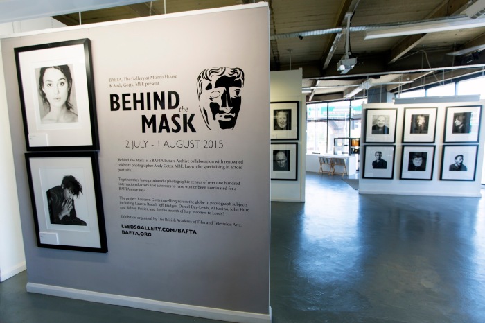
I took a look at different styles of exhibition content, and spent time reading the text that accompanied the pieces. In the Behind The Mask exhibition, the biggest collection of BAFTA-winning actor portraiture ever assembled to take over entire west wing of Somerset House (BAFTA, 2013), the text is broken into three short one line sentences. It explains who the exhibition is by, a general description of what it’s about, and finally a little more detail about the content. The simplicity of the language is very readable, for any audience; it’s short and to the point.
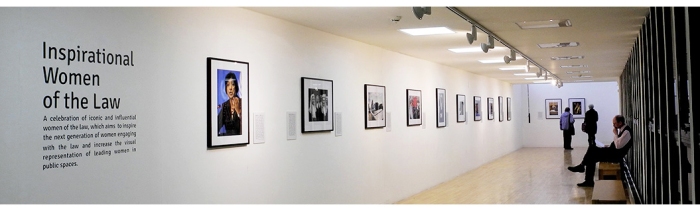
A different approach can be seen in the Inspirational People of The Law Exhibition (2015) at Newcastle University. In this piece, there is simply one short paragraph explaining exactly what the exhibition is under the large title.
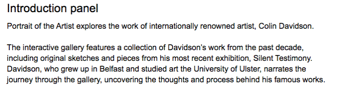
For our piece, the struggle that I was having was knowing wether to focus on the content of the exhibition that we are creating, which is a collection of Colin Davidson’s work through his life, or to introduce the exhibition in the broader context of Portrait of The Artst, a VR documentary experience. After looking at these examples amongst others, I decided to focus on the exhibition of Colin’s work, rather than mentioning the VR experience. The exhibition of Colin’s work is part of the experience, so the viewer should not be taken out of that world, with a reminder of the fact that they are in VR. If we were to show a panel describing the broader context of Portrait of The Artist, that would fit in a display for our final year project at the exhibition rather than within the piece.
In light of all of this, I wrote a short and simple summary of the gallery to introduce the participant the the space as they walk in:
Writing For the Gallery – Content Research
Having figured out the goals of the gallery’s introductory text, I took a look at some advice on best practice for gallery writing by the Victoria And Albert Museum, London (Trench, 2013). Not only does the writing need to be clear and informative, it needs to actually engage the reader. As Trench writes, “to appeal to readers and visitors, text also needs personality, life and rhythm.” Gallery Text At The V&A sets out ten top tips to create great content:
Write for your audience
Stick to the text hierarchy and word count
Organise your information
Engage with the object
Admit uncertainty
Bring in the human element
Sketch in the background
Write as you would speak
Construct your text with care
Remember Orwell’s Six Rules
Write As You would Speak & Bring in The Human Elements
There were a few areas of this advice that was more relevant than others, so I took nuggets of information from the document to help inform my work. For example, the advice to “bring in the human element” and “write as you would speak”, was particularly interesting, as I had struggled to choose what tone I should be writing in. I had previously thought about quite a formal text to accompany the work, as I feel like that’s what I ‘m used to seeing in galleries. However, this can be quite dry to read as a viewer. This research challenges that thought, and encourages the practice of connecting with the audience. As Trench writes,
“We know from the Getty and other research that people connect with people. This presents a problem in museums, where objects have been divorced from people. But there are ways we can reconnect people and objects.”
Trench goes on the explain ways of connecting people with the work, for example,using humour, relating the work to present day concerns, link the past and the present, the familiar and the unfamiliar, and using quotations are all different methods.
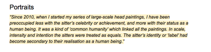
With this in mind, I used a variety of these methods to write for certain panels. In the Portraits gallery, I only used a quotation to tell the story behind the work. The decision to do this rests upon the research to connect the viewer to the work. As well as this, the idea of “common humanity” is a fundamental theme in Colin’s work, so I wanted this idea to stand alone, and not be cluttered by any other information.
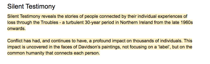
In Silent Testimony, I used present day concerns and linked the past and the present in the text. The idea of loss is something that nearly everyone can connect with. Similarly, conflict is something that is sadly something we can all relate to. By connecting
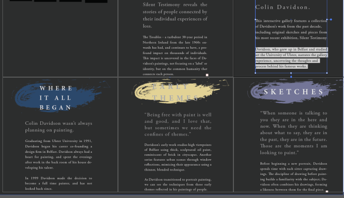
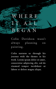
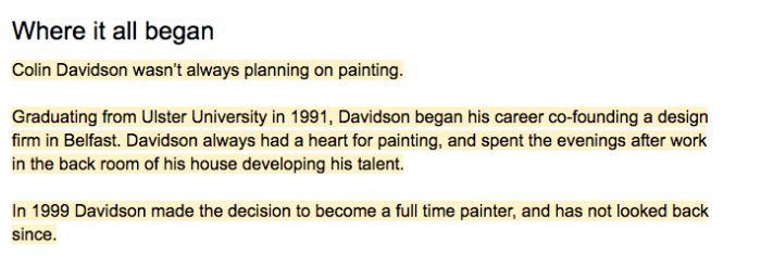
In the Where It All Began panel, I used the advice to write for the audience, write as you would speak and brought in the human element. This section could easily have been a factual panel about Colin’s degree in art, and his design firm. With the research in mind, I used it to tell a story. I used the hierarchy of text to draw the reader in with a mildly surprising sentence, “Colin Davidson wasn’t always planning on painting”. I then went on to recall a colloquial story that Colin shared.
Write for your audience & Stick to the text hierarchy and word count
Throughout the process, I was very cautious of not overfilling the piece with text. In virtual reality, I had discovered that is is not enjoyable to read large bodies of text, so in the earlier design of the space, I tested placeholders to see what was the right word count to structure the text against.
This slideshow requires JavaScript.
Having this placeholder to work with was really important in writing for the gallery, as it forced me to write with the confines of a word count. As I had previously tested and researched, I used typographical hierarchies to draw the viewer in. The practice of being succinct is a tough one, so I really had to consider every single word, and question if if were necessary or not. I wrote everything in a word document and then tweaked the text to fit in Illustrator, refining and refining until I had the text as short as possible.
As Trench writes,
These word limits don’t restrict the amount of information that most visitors absorb. Instead, they increase it. In a gallery or exhibition, less really is more.
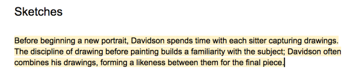
She goes on to highlight that there is a real difference between the complexity of information that can be gained through an exhibition and that which is suitable for a book. For this reason, each of the spaces were limited to a certain number of words. If I could communicate the message in less, that was even better. For example, in the Sketches section, I felt the this short paragraph was plenty.
Placing in the Space & Oculus Testing
Finally, I placed the new textures in the space, testing that they worked along the way. I then packaged the textures to be replaced in the master scene, where we were able to try it in the oculus.
We were really pleased with how this turned out, and felt that they had just enough information. The next step is adding the audio triggers and cutting together the narration.
Citations
Nicholas, B. (2007) Introduction To Documentary. In: Anon.Introduction To Documentary. 2nd ed. Indiana University Press, 13-20.
Throughout the course of this project, the asset development has been an extremely iterative process. We have always started with tests, and build upon them until we felt like things were moving in the right direction. Every time something gets completed by whoever creates it, we review it as a team. With virtual reality, it’s extremely important to try the piece in the headset, as the screen often feels very different.
Landscape Development
Fiona had been working on the development of the landscapes for one of the scenes where Davidson chats about being creative within the confines of ideas and themes. We were discussing her progress and how it fitted into the piece as a whole. The early developments did not feel like they were working as well as they could and we were trying to figure out why.
When we thought back to the idea behind this element of the piece, we recalled that it was about creating structure from the loose freedom of paint. With this in mind, I suggested that the transition is created by the large paint stroke within the scene – and it adds to the landscape build up – rather than having a new blue stoke form.
Conceptually this worked better, as Colin was speaking about freedom within the confines of ideas and themes. Visually, this solution acts as a transition to the next scene, which removes the problem of having disjointed scenes that don’t flow easily from one to the next.
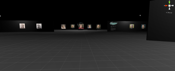
While we were happy with how the Explorable was shaping up, from some user testing we discovered that people did not quite know where to go once they passed the first two panels in the space. There was quite an empty space.
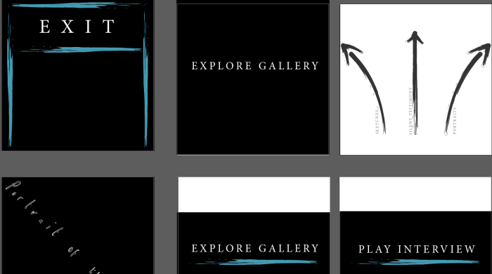
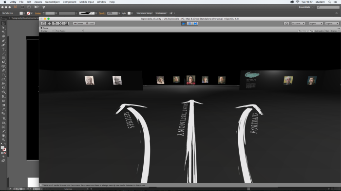
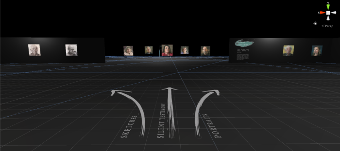
Designing Navigation
With this in mind, I began to think about how to make this navigation easier. I started by creating a few arrows in the style of the strokes in the panels, labelling the directions of the sub-exhibitions. I wanted these arrows to feature on the ground plane in the space, so they do not affect the participants immediate field of view, but have enough of a presence for the participant to notice them if they are needed.
Upon placing these in the space, they were really bright and too intrusive. As the participant approached the arrows, they had to walk all the way to the end of them to read to writing. However, I did feel that they helped guide the walking direction.
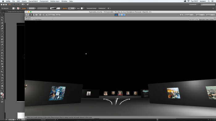
Edits after Testing
I changed the colour to a darker grey so make the navigation more subtle. I also moved the positioning of the text to the base of the arrows as it is in the direction that the participant will be moving in. After testing with a few people in the VR space, these changes made a big difference to the navigation and helped give an idea of what was coming before they reach the sub-galleries.
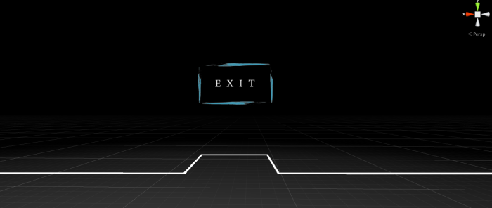
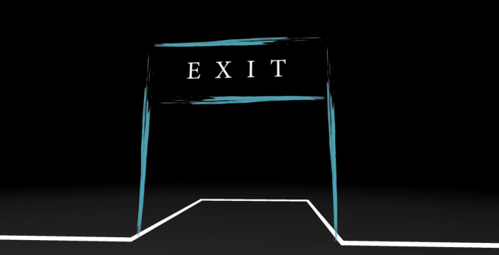
Exit
Navigating to an exit was also something we wanted to be able to do in the explorable. From my research into gallery spaces and development from that, I created a linear space that does not take long to walk from one end to the other. We wanted the participant to have enough information to enjoy as long as they wanted in the space, but if they only had a short time, it’s important that they feel they can exit quickly within the space.
In the same style as the designs, I created a little exit sign, where the participant to walk through to return to the home screen.
After testing it in Unity, we felt that an archway would be clearing and more inviting to walk through.
From here, I’ll package these assets and pass on the the Master Scene, where we will add the logic to make the interaction happen.
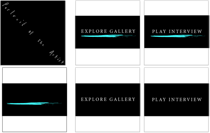
It’s pretty easy to neglect the little things and our poor menu design had been sitting gathering dust on our doom list for weeks. After doing the explorable typography development, I used those influences to create the menu.
From our VR research and from inspiration from pieces like the VR experience, Clouds, our piece has taken on a black background throughout, with floating particle effect to maintain presence. We wanted this research to take effect in every touchpoint of our experience, even in the menu.
Design
We learnt from our numerous tests and research into how to create great experiences in VR, that the first 30 seconds or so in the virtual space can be disorientating and that it is important to give the viewer time to acclimatize to the space. For this reason we have decided to keep the menu very simple, with light particles to create presence and only a few menu buttons.
For the design of the menu, I maintained the same title and typeface as the explorable to maintain consistency. I then create a colourful painty stroke to mimic the strokes of paint through the piece, and the explorable design.
For the button click interactions, I had thought that it would be a nice touch for the paint stroke to appear upon hovering the button; to give the viewer a visual reaction to their interaction with the piece. While this would be a nice touch, we are not sure if it’s possible in our time limit with a number of other things on our to do lists. I saved out each of the buttons, including the stroke, to give us the option anyway.
We had decided to place an image of Colin in the menu to give the participant an idea of what to expect. For this, I took a screenshot from Visualise, tidied up the edges in Photoshop and added a spotlight and some shadowing. This will then be placed in the center of the menu.
We then added these elements into the master scene to see how they feel in VR. We may need a slight bit of repositioning, but they work well so far.
After reviewing the piece in the Oculus this week there were a number of things that we were hoping to tweak and replace. Our approach through this whole project was to build an MVP quickly, with all of the elements of the piece. From there, we would build and add to it. This is taking the best practices from the scrum methodology, which has proven to be a really efficient way of working this semester.
Celebrity Heads – Timing Edits
One of the things that I was hoping to change was the alpha scripts on the celebrity heads. While I felt they were going the right direction, I was not happy with the animation on them. They were doing this strange fizzle in animation, which I did not like. Referring back to my earlier tests and research, I knew that toggling the opacity was not possible for this method, but a sweeping animation was. In light of this, I went into photoshop to edit the textures, changing the threshold on the alpha channel, to allow this animation to happen. I then went to the script, and began tweaking the yeild and timing values to get the timing for the heads correct.
Celebrity Heads – Texture Edits
Finally, I went back to Maya, and then photoshop again, to edit the textures to refine the details of the faces. I did not feel that they had the right level of definition or balance between strokes. One of my favourite heads is the Angela Merkel one because of the simplicity of the line drawing. This also happens to be the piece closest to my early references. In light of this, I edited the textures of the two men’s faces until I was happy with the. Below is a video showing the textures I rested on.
Oculus Testing
We then tested in the Oculus to see how it felt. We were all happy with how they now animated, as it felt more purposeful and confident than the previous animation. Nicole and I sat together tweaking the scale and positioning until it was as good as we could get it. The challenge here was that the fade box that we use to transition Colin’s sequences limited the physical space to position the models within. For now, we placed them where we felt would work as a placeholder, and in the meantime Nicole is going to take a look into finding a way to move them in a more 180 degree positioning.
After making a lot of progress as a team, we decided to take a step back with our planning this week to figure out what needed done. We sat together with the project and watched it multiple times each, taking notes as we went.
Edits and Suggestions
With the functionality now working on the interview, we are at the point where we can refine it. Over the last week or so, Fiona and I have been finishing up the assets, so that they can be tested in the build.
We addressed some of the constants we felt that should be used in the scene, such as the use of a ground plane, spot lights and Colin’s transitions. Occasionally we were getting snappy transitions between the scenes, so we took note of each one in the hopes that we could address the problem over time.
I made the suggestion to make Colin closer to the camera. While it was easy to see Colin, we felt that it was important to be making use of the fact that he was upon a 3D mesh. The closer Colin is to the viewer, to more obvious the tracking system in the Oculus is. There is something quite special about the intimacy that the Depthkit recordings allowed us to create – and we did not want to loose that by having Colin far away from the viewer.
From here we made a new doom list, highlighting the work for the next couple of weeks. A lot of the jobs now involve small tweaks and refinement of the experience, and adding content to the explorable.
One of the elements of our animatic features a number of frames surrounding the viewer in a circle. These frames have a slight animation on them, where they chase their tails. Fiona had done a little testing with this, but we decided that the corners should be slightly more rounded, and the lines more paint-like, rather than having a hard edge.
Painting in Photoshop
Some of my early research on painting helped inform my development of the painty frames. As these frames won’t be close to the viewer, they did not need a huge level of detail, but it was still important to reflect the oil paint style that the interview is referencing. I was aiming to create a stroke that was one singular colour with a hint of white, with a shape that mimicked the linear brush lines.
After looking into Colin’s work up close, I began playing with a couple of Photoshop brushes to create my strokes. I created the illusion of a thicker paint in the center by using a build up of white to fill in the lines. I made the stroke more opaque in the middle, and let the lines disperse a little more to the outside as a real paint stroke would often do.
Animating in AE
I took to After Effects to do the animation and took a look at a few tutorials to see the best methods to animate the frames. Focus 8 gave the option of downloading a plugin to animate a flat layer along a path. While this is an interesting approach, I felt that it may distort the texture, so I decided to try something different.
In the end I chose to animate a stroke along a path, revealing the texture below. The Tron lines video below was the closest video that describes the process. This method allowed me to create the whole texture of the frame in Photoshop, and then draw a path to match the frames. I then added a stroke, set it to reveal what was below, feathered the stroke, separately feathered the mask and then animated it.
Transition Challenges
One thing that the animation does in the animatic is fade in for the transition, however, at the time of creating the frames I wasn’t sure if a fade in was possible in Unity. If it was not possible, I would have to animate the transition in this process (ie. snaking in from nothing), but if it did work, I would be able to just loop the animation.
In After Effects I created both animations to have options to work with. I did this by first animating the stroke growing. I then created another mask to be animated as the stroke completes it’s full rotation, which gives the impression that the frame is chasing its tail.
Saving out Sprite Sheets
After animation, I exported the files as a transparent png sequence which I then added into Photoshop to create my sprite sheets. I decided at this stage to create a loop (instead of the paint stroke growing from nothing) for the sprite sheet animation, as it is easier to add to a loop than remove from it, if required.
As I knew the textures were to be animated on sprite sheets, I had created my paintings on large 2K files so that I could maintain optimization in the space.
This slideshow requires JavaScript.
I began matching all of the pngs to a grid, making sure each lined up perfectly together, with no overlaps and no gaps between the images. This was a long and tedious process which took a couple of attempts to get right. Below is an example of the pink frames sprite sheet once complete.
Testing in Unity
With the sprite sheets complete and the frames made, all that was left was testing in Unity. I set up the scene that Fiona had previously made the frames for, to try my new textures. I added a script to each model and edited the values, to match the size of my textures.
Editing the animation in Unity
After getting the sheets working I was not a fan of the total uniformity of the set up. Each frame animated at exactly the same time in exactly the same way which didn’t feel natural and was too far from the original animatic. After a bit of tweaking and testing, I discovered that I could edit the frame rates to stagger and slow down the animations. After doing this, it felt much more fluid and as I had imagined.
I finally packaged up these elements for Nicole to add into our master scene in Unity.
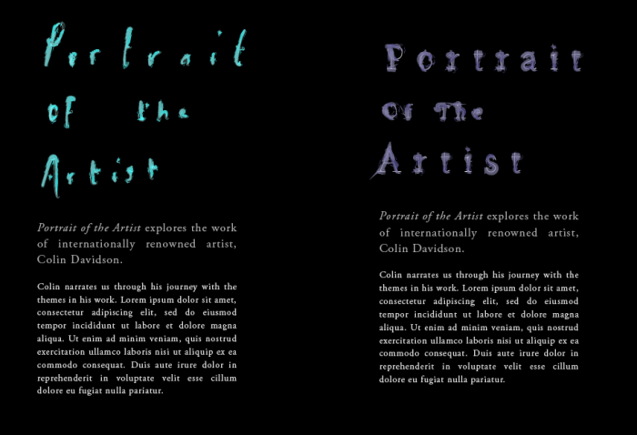
After developing the titles, my next steps involved pairing them with our chosen fonts for the text on the panels.
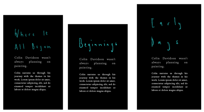
I found that for the main title, the hand drawn type was the most appropriate. The title was to feature as an introduction to the explorable gallery, so I wanted to hint at what was to come through the styling of the type. I do feel that the colour in the above instance is too intense so I may change it to a more sophisticated monochrome style, but for now, the hand drawn style works for us as a team.
Layouts
I began testing a few layouts to see how to best position our text in the space.
This slideshow requires JavaScript.
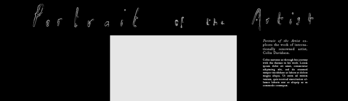
After sharing with the team and having a chat about the work, we found that the layout below was the most impactful. By having a long title sweeping left to right with the lower hierarchy text on the right hand side, the eye is drawn from the left to right and down to the text.
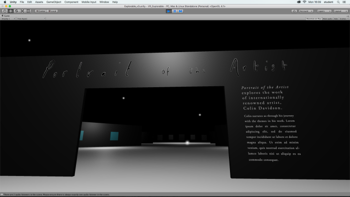
From previous research into Game Design, Virtual Reality spaces and Physical Architecture, I learnt the importance of testing in Unity and VR as I went through each element of the space. I tested it in Unity on the gallery, and found that the text wasn’t as high quality as I’d like on the geometry’s UVs. I tried the textures out on 4K panels, and changed around the shaders in Unity to get a sharp image of the text.
I’m aware that the typography arrangement is not perfect in this title yet, but in general I’m pleased with what it’s doing as an arrangement. It’s exciting to replace placeholders with real text, and I can’t wait to keep developing the other elements and see the whole space come together.
Developing Sub-Exhibition Panels
The next stage of the gallery I had to work on was the exhibition panels. From looking at galleries in the real world and then testing the text in the space, I learnt the importance of the “less is more” rule when it comes to text in VR. It’s difficult to read, or pay attention to text for too long while in the Oculus, so I was mindful to only create space for a limited amount of words.
I began by testing how each panel could look with the same sort of hand drawn type as the main title. I felt that the readability was not great, but also that the hand drawn look did not feel very professional.
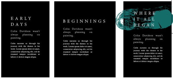
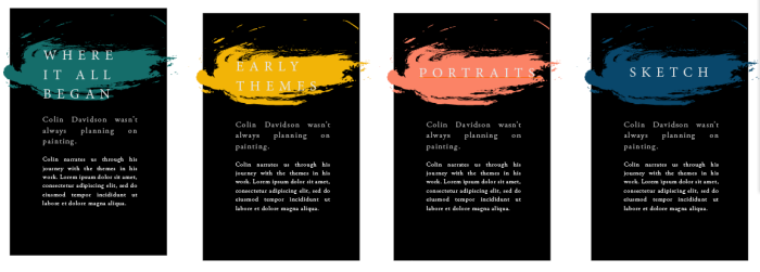
In light of this, I decided to try out the typography hierarchy which I’d previously set up using Minion Pro and Adobe Garamond Pro. These tests had much more elegance, and I was pleased with the direction they were heading. However, with the classic typeface I felt that I was loosing some of the playfulness that I had been exploring in the previous tests. The painterly elements were important to tie the interview and the gallery together as well as adding character to the space. With this in mind, I tried to see what it would be like to add a splash of colour to the panels.
I then tried a few different iterations to see if I could achieve a more interesting stroke.
The bottom right test was my favourite; the stroke’s solidity made the text pop, while still maintaining the feeling of a paint stroke. I then started to test what each panel could look and feel like with a similar approach, using colour to differentiate them.
I was happy with where the panels were going, so again, I tested them in Unity against their respective gallery spaces.
Feedback and Updates
I shared these spaces with the team and Fiona suggested we use the colour scheme from the interview for these panels. I changed the pallete around and the space felt much better with the continued colours which had been picked from Colin’s paintings.
This slideshow requires JavaScript.
Populating the Space
With the team happy with were things were going, I then populated the space with the high quality prints Colin had sent and the new panels. I then made the scene walkable, so we could get a feel for it all in together.
One thing that I wanted to be sure of testing was the amount of text that I placed in the scene, and if it was readable. Having previously tried text in the VR space and I knew that it was hard to read too much, so we wanted to make audio edits to accompany the work. After a couple of iterations I felt that I found the right balance.
I felt a sense of achievement in seeing the thoughts, research and development all come together to make this gallery. The next steps will include packaging the whole scene to be moved into Nicole’s master scene. From there I’ll then be cutting together Colin’s audio narration and adding it into the space, adding some particles like the interview, and adding an ambient track in the background.
After my early developments with the typography for the explorable space and research into typography in galleries, I knew there was a little more work that needed done. With the explorable gallery layout finalised, I had set spaces where text was to go. My next steps as far as the text was concerned, was developing and finalising the panel design, and writing the content for the exhibition. Required pieces included:
One Title image
One Intro Panel
Five Sub-Exhibition Panels
One Exit image
Potential Navigation Design
Hand drawn Typography Development
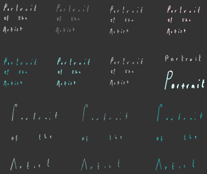
After researching gallery signage, I decided that a large title image would be an effective way to enter the explorable gallery. My early experiments show a brief look into what this could be; I explored a couple of approaches using hand drawn typography and altering classic typefaces with giltchy strokes. While I was happy with the direction of these, I wanted to dive a little deeper in their visual development so that I would have a range of options when I go to the team to make our decisions together.
Hand Drawn Type
I began by drawing a few letter combinations, varying the style of my handwriting a few times to see what worked best in the context of our title image. The idea behind this was to mimic a painty artist’s signature, as well as using the stroke to tie into the visuals of the overall piece.
With the variations in the writing style, I then began playing with how strokes would effect their finish. What I felt was working in the last tests, was an unfinished painterly stroke. I created a few iterations of this style, adding or subtracting detail with each one. For some iterations I layered the strokes, to see how more subtle additions would work, and for others, I kept the stroke simple with no fill colour and a plain stroke on the outside.
What seemed to work the best here were thick base strokes, and fairly long round lettering. The examples where the base strokes are extremely thin are interesting up close, but in the context of a title piece, they would not have nearly enough impact.
Classic Typeface Alterations
Building on my previous work, I wanted to explore the use of a more structured typeface as a base to build the title upon. With the hand drawn tests still in my mind as a good option, I thought I would try to combine the classic typeface with more painterly elements. I drew over Minion Pro, the typeface we had decided upon for our top hierarchy text, to achieve the general structure of the lettering, but get a more sketchy look.
I felt that there was something quite impactful about having a “painty” element in the titles, so I chose to explore this in many of my tests. The different iteration purposefully ranged from subtle to extreme, to give us a good idea of what is possible.
Upon reflection on these tests, I feel that the glitchy look distorts the words too much and makes the text difficult to read. While I like how the random spikes in the lettering bridges a connection on the appearance of Colin’s interview, it is most important that it is fit for purpose and if it’s not readable, it’s not doing it’s job. To me the more subtle pieces work best in these tests, where there is a hint of paint, but it’s not so obvious that it’s cheesy.
Next Steps
I shared my work with the team and when we looked at both the hand drawn and classic type with alterations side by side, we were leaning towards the hand drawn look as a preference. They both have something interesting about them in their own right, but for a feature image, the hand drawn type has more character. There is a resemblance of an artist’s painty signature or a painty blobby stroke, without being too obvious. While it’s certainly not subtle, I think there is a nice balance of giving the viewer a hint of what to expect in the tone in the piece, without giving too much away.
I’m getting close to the style that I set out to achieve but I need to see both the hand drawn type and the structured type paired in the context of the panel with the accompanying text before making the final call. The next steps include pairing the type, reaching out to the team for their opinions on it and developing it appropriately.
While I was testing the sequences in Unity and getting the action lists running that Nicole had set up, I noticed a couple of editing problems. There were a number of clips that were a few frames out of sync, had audio issues, or that had the start or end cut off. While it was only a frame or two off on the different clips, I felt that it was important to get this interview edit right to bring the production quality to a higher level.
I made a note of each edit that needed made as I went through the clips, and then Nicole and I sifted through the sequences to see if they needed re-rendered in Visualize, reexported through the terminal or if the problem could be fixed in Premiere. Luckily most of the edits were able to be made in Premiere, and there only a couple we had to bring back through the terminal. I then sat with the Premiere scenes and synced the frames to the right points.
This part of production is time consuming and can be frustrating at times, but taking the time and effort to perfect the process is always worth it for a better final result.
After a couple of tweaks here and there to the Maya layout for our explorable section of the experience, I exported it and brought it into Unity.
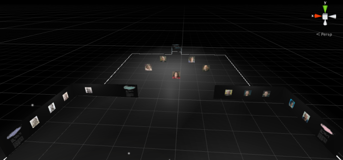
I set up a player so that we could walk around the space and see how it felt to be a part of it. I wanted to see how the distance between the galleries felt from the user’s perspective. From my previous research into games development and Oculus experience design, I created this space aiming to give the player enough information to keep it interesting, without too much distance between pieces to keep the experience length short. I found that the player was going a little slow, even for the Oculus, and by increasing the acceleration of the player from what we previously had aided a smoother transition between pieces.
Creating walkable spaces has been an integral part of our piece’s development as it allows us to get a feel for the space before it’s complete. The next stage will be adding lights, images and typography to fill the space – from there we will repeat the walk through process and build it up until we feel like the experience feels as impactful as we are aiming for.
Before launching into more designs, I took some time to study the content of our exhibition in more detail. I broke down the core elements of Colin’s work, and the content from our interviews into five main sections:
Inspiration and Childhood
Transitions; from art college to design firms, from design firms to painting
Belfast paintings and reflection paintings
Portraits
Silent Testimony
In my previous research about curating galleries, I learnt the importance of creating goals or themes in a gallery. In lieu of this, I thought up a couple of themes or approaches to take:
A timeline approach
This approach brings the participant on a chronological journey through his life and work beginning with early days and inspiration.
A feature approach
This approach would feature popular pieces at the center, and have opportunities for the user to explore other areas off to the sides.
These clear guidelines gave me two strong directions for developing the ideas.
Timeline Approach
In my previous tests I found that a forward facing design worked well for the participant experience. With this in mind I began designing some new environments.
I immediately found that the linear layout felt better; the path down the center allows the participant to see elements of each step of the way, without giving too much information away or crowding the experience.
Silent Testimony
The gallery space for Silent Testimony was something that I was in two minds about. It’s a powerful exhibition about people who have lost close family or friends in the troubles. In real life, the exhibition had a beautiful stillness about it; the gallery room fell quiet as you entered and viewers were very respectful of the space. Knowing this, I was hesitant to merely slot a few images from Silent Testimony in the linear open space – I feel that it needs space, physically and emotionally, for the viewer to take in the work.
This slideshow requires JavaScript.
I decided to add a small side room onto the space, to see if the gallery would feel appropriate there. I first created walls around the space but it didn’t fit into the open environment. Removing walls, adding stand alone paintings and front panels (which would be title panels) worked much better. Whatever way it’s incorporated, I feel that the Silent testimony element needs to feel slightly isolated from the other work.
Feature Approach
This set of layout tests places Colin’s most popular pieces as a featured gallery in the center of the exhibition. The spaces to the sides would then host supporting content. This content would be grouped in three prongs:
Colin’s inspiration from the past (Left Gallery)
How this influenced Colin’s most popular work (Center Gallery)
Present Exhibition of Silent Testimony (Right Room)
This slideshow requires JavaScript.
This approach tests out a smaller layout which shortens the length of the experience for the participant. In the design of the space, I am wary that virtual reality can be overwhelming to be immersed in for a long time. The close proximity from gallery to gallery would give the participant the opportunity to see most of the exhibition is a short space of time.
The danger of this approach is that there’s not enough to see. It could be boring, as every aspect of the exhibition is viewable from the first moment the participant enters it. My previous research shows that anticipation is a core principle in good came and spacial design, and I feel that this approach there is not enough of it. For that reason, we are going to continue the development of the timeline approach.


 Write for your audience & Stick to the text hierarchy and word count