In addition to a Making Of Video, we wanted to create a teaser trailer to give people a taste of what is to come, and encourage people to view it at the end of year show. After collecting the footage from Rachel and creating numerous screen recordings from our work, I was able to begin working on this.
The goal of this piece was to showcase our work, not necessarily showcase the process or the team. For this reason, I kept the edit short and snappy with hints of all the areas of our piece through it.
Bloom by Odesza sets the pacing of the piece, and adds to an energetic and exciting edit. View the final cut below:
We have always had it in our minds to have accompanying audio clips to each sub exhibition in the gallery. These would contain narration from Colin’s wider interview, where he talks about the inspiration behind his work. We felt this would be impactful addition to the space and an effective way to give the participant extra information. As I learnt from my last research and testing (LINK), it’s difficult to read a lot of text in VR, so audio would be a better way to add this.
After spending a lot of time writing for the gallery and figuring out what the story of each section should be, I had an idea of how to approach this space. Fiona had taken a look at the clips, and quickly realised that it’d take a bit of time to curate the content for a number of reasons. Because I was already very involved in the content of the gallery, I took over to make the best use of our time.
Challenges
The main challenges with the content curation were to do with timing. After discussing it with the girls, we decided that each clip should be no more than 60 seconds. This meant that I was trying to summarise Colin speaking about years of his life’s work in 60 seconds.
Colin is a slow speaker and also has a stammer, so it took a lot of time to tightly edit a range of clips that cut out the in-between pauses.
The interview wasn’t conducted for this information. With the explorable gallery designed and created after we got our interview, we had never conducted the interview for it. It was originally only intended for the interview section of the piece. While we were lucky to have gain much more information than we needed for the interview, the content does not totally fit with what we have. This meant that I had to chop up a large range of pieces, not only to make them fit, but to make sense as a story.
Action
Always up for the editing challenge, I took myself into a quiet space with my headphones and gave the piece my attention. I made note of the goal of each piece before editing it, so that I was pulling the correct information out, and supporting the paintings that were on display.
This slideshow requires JavaScript.
You can see in the above images, that each 60 second clip has numerous cuts and edits. I had to jump between a number of sentences and clips to achieve a cohesive story. However, after a number of iterations, and tests, I finally got there. I feel that the motive of the sub-exhibitions come across in the edits well. You can hear them below.
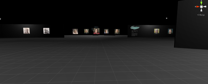
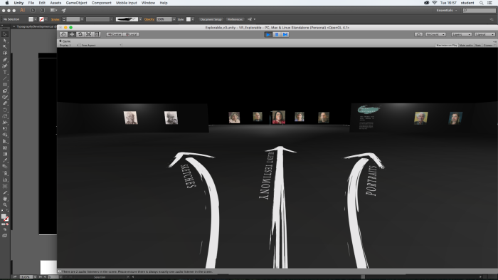
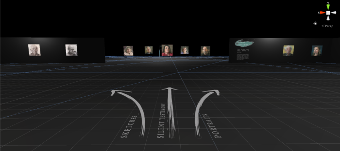
While we were happy with how the Explorable was shaping up, from some user testing we discovered that people did not quite know where to go once they passed the first two panels in the space. There was quite an empty space.
Designing Navigation
With this in mind, I began to think about how to make this navigation easier. I started by creating a few arrows in the style of the strokes in the panels, labelling the directions of the sub-exhibitions. I wanted these arrows to feature on the ground plane in the space, so they do not affect the participants immediate field of view, but have enough of a presence for the participant to notice them if they are needed.
Upon placing these in the space, they were really bright and too intrusive. As the participant approached the arrows, they had to walk all the way to the end of them to read to writing. However, I did feel that they helped guide the walking direction.
Edits after Testing
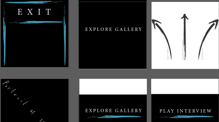
I changed the colour to a darker grey so make the navigation more subtle. I also moved the positioning of the text to the base of the arrows as it is in the direction that the participant will be moving in. After testing with a few people in the VR space, these changes made a big difference to the navigation and helped give an idea of what was coming before they reach the sub-galleries.
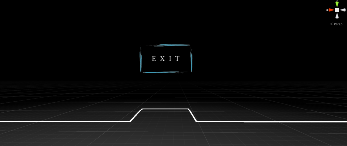
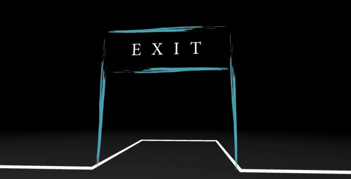
Exit
Navigating to an exit was also something we wanted to be able to do in the explorable. From my research into gallery spaces and development from that, I created a linear space that does not take long to walk from one end to the other. We wanted the participant to have enough information to enjoy as long as they wanted in the space, but if they only had a short time, it’s important that they feel they can exit quickly within the space.
In the same style as the designs, I created a little exit sign, where the participant to walk through to return to the home screen.
After testing it in Unity, we felt that an archway would be clearing and more inviting to walk through.
From here, I’ll package these assets and pass on the the Master Scene, where we will add the logic to make the interaction happen.
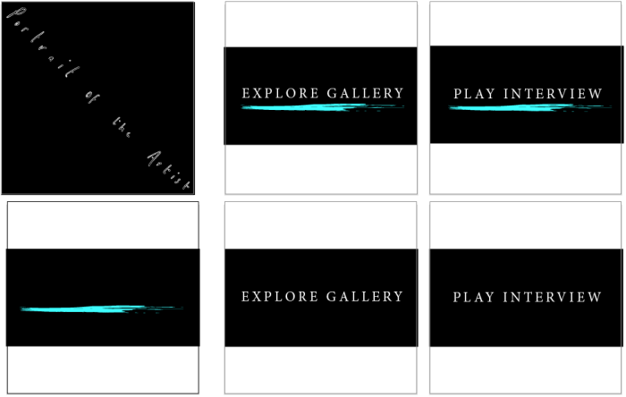
It’s pretty easy to neglect the little things and our poor menu design had been sitting gathering dust on our doom list for weeks. After doing the explorable typography development, I used those influences to create the menu.
From our VR research and from inspiration from pieces like the VR experience, Clouds, our piece has taken on a black background throughout, with floating particle effect to maintain presence. We wanted this research to take effect in every touchpoint of our experience, even in the menu.
Design
We learnt from our numerous tests and research into how to create great experiences in VR, that the first 30 seconds or so in the virtual space can be disorientating and that it is important to give the viewer time to acclimatize to the space. For this reason we have decided to keep the menu very simple, with light particles to create presence and only a few menu buttons.
For the design of the menu, I maintained the same title and typeface as the explorable to maintain consistency. I then create a colourful painty stroke to mimic the strokes of paint through the piece, and the explorable design.
For the button click interactions, I had thought that it would be a nice touch for the paint stroke to appear upon hovering the button; to give the viewer a visual reaction to their interaction with the piece. While this would be a nice touch, we are not sure if it’s possible in our time limit with a number of other things on our to do lists. I saved out each of the buttons, including the stroke, to give us the option anyway.
We had decided to place an image of Colin in the menu to give the participant an idea of what to expect. For this, I took a screenshot from Visualise, tidied up the edges in Photoshop and added a spotlight and some shadowing. This will then be placed in the center of the menu.
We then added these elements into the master scene to see how they feel in VR. We may need a slight bit of repositioning, but they work well so far.
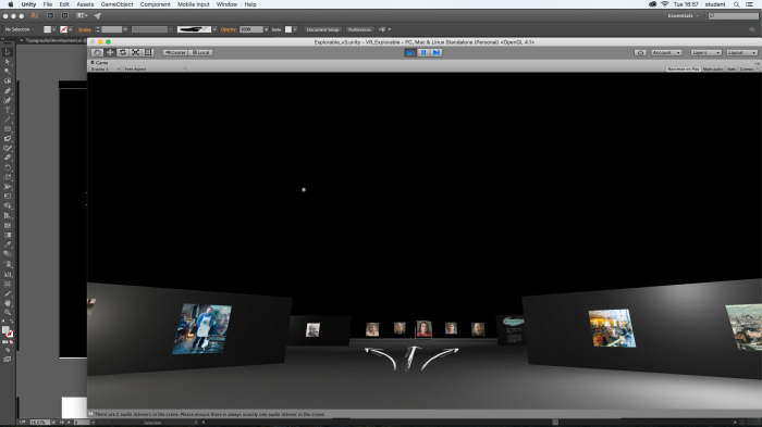
This week I spent some time building on the work that I had previously done for the explorable section of our piece. To recap, we currently have a walkable gallery that we have tested in Unity, with placeholder images and a plan of the layout. There are a range of things still to think about, including lighting design, typography and audio.
Content Development
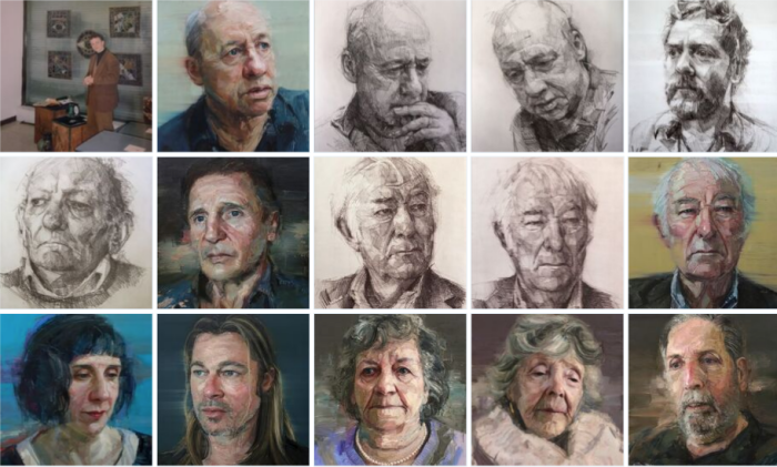
We previously had placeholders for paintings and so I made efforts to begin to populate the space. Having previously decided on the layout, with sections allocated to different themes and development in Colin’s career, I knew roughly what we needed. I got in touch with Colin Davidson to receive high quality images of his paintings for each part of the gallery. We felt that the high quality was important, not just to bring a professional finish to the piece, but also so that the viewer could get up close to the paintings without losing the quality.
A few tweaks
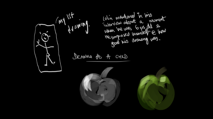
Colin sent through a range of what I had asked for, which was amazing, however there were a few images he was unable to send. We had originally planned for a section at the beginning of the gallery to have a few images of Colin’s childhood and images with him and his father, who is also a painter. We only had one image of Colin in art school, which could not stand totally alone. Without these images, I realised that a few tweaks had to be made to the flow of the gallery.
After a discussion with the girls we came up with a solution; we could still talk about Colin’s early days by using the one image of Colin in Art School and one image of him in his studio now. The other section, would then be populated with paintings from Colin’s Belfast theme, and the window reflections theme; two painting styles which Colin mentioned, heavily influenced how he painted people.
Rejigging the explorable
The explorable in Maya need a few tweaks on the basis of these changes and I also noticed that a range of the UVs weren’t done. I took time to redo these, to make sure that our typography, when it comes in, can be placed seamlessly.
Next Steps…
With the layout and content fixed and gathered, our explorable environment is ready to be populated. Things we’ll be thinking about:
Typography – I’m going to be spending time developing the design of the typography. This includes title artwork, how each section is introduced and any information that the participant has to read.
Light design – From previous feedback, we realise that we need to guide the viewer through the space using light. I’ll be putting effort into testing the best way to do this.
Painting Layout – Physically placing each of the paintings at a height and scale that is most effective for the viewer
With these things in mind, I’m really looking forward to seeing these things come together. Where previously everything was in testing, this is now all working on the final setup, so I will be constantly checking myself against the goals of the piece to ensure that my designs align with our original aims.
After my earlier tests achieving a glitchy style, I took the chance to play about with it a little more. Legibility of the lettering will be important so this style wouldn’t be fit for purpose, but a slightly more stripped down version of it may be interesting.
Complimentary Pairings
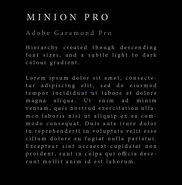
While looking at the freehand type I’ve also been bearing in mind the typography that will communicate more information for us. Minion pro and Adobe Garamond Pro with descending size and gradient from light to dark supports the work in a professional and sophisticated style. These fonts were chosen to mimic some of Colin’s current exhibitions as we felt that it was important to reflect all aspects of his style, from exhibition set up to painterly strokes, in the digital space.
Testing In Unity
From previous research into Game Design, Virtual Reality spaces and Physical Architecture, I learnt the importance of testing in Unity and VR as I went through each element of the space. When I tested the above piece in Unity on a 4K texture, I was able to create a clean crisp image, but I noticed that it was a challenge to read too much text. This block of text (although only lorem ipsum), was on the limit of too much text, so when I’m writing the content for the space, it will be important to bear this in mind.
Colin uses a mixture of large brushed strokes as well as intricate watercolour to create his paintings. We want to have a complimentary blend between the digital depth kit footage and Colin’s painterly style.
I could see a couple of these strokes working to introduce the piece in the explorable set. From my previous research, there is often a large featured piece of typography for the title of an exhibition, followed by more traditional classic styles which are more readable. I’m imagining a painterly title could come across well in our space.
Developing Titles
I started to play with alternate handdrawn typography as a possibility for our title lettering in the explorable.
The experiments varied in style and brush stroke. The portrait lettering I drew by hand in a naive style. What I was trying to achieve was the sort of style that a painter may sign their name with at the bottom of their pieces. While it was an early test, I could see this hand drawn style matching well with our chosen fonts of Adobe Garamond Pro and Minion Pro. In the tests with Colin’s name, I wanted to see how colour, tone and form would affect the overall appeal of the lettering. In some of the watercolour styles, the paint stroke spikes out away from the letter. While this may be seen as a technical fault due to scaling, it could actually work to our advantage. This glitchy look is something that will feature through our piece with the DepthKit imagery, so it may fit nicely to have something introducing the explorable element.
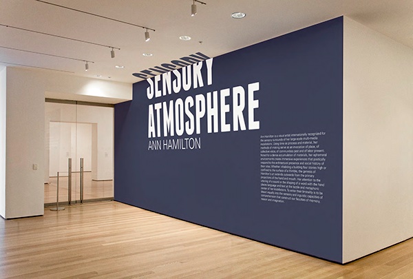
Like in my early gallery research, the style of the titles always complimented the content of the exhibition, and this is something I’d like to try to achieve for our piece.
In many of the exhibition designs that I have come across in my research, a huge title often features. The hierarchy of typography is an important element to exhibition design, and something that I want to pay attention to in our project. The idea of an explorable gallery space is a fairly simple one (in comparison to a game for instance), so it’s vital for us to pay attention to the details of how it is made up.
MOMA Design Studio – Applied Design
MOMA’s Design Studio’s Exhibition, Applied Design has a beautiful approach to their titles. By projecting a number of icons (the theme of the exhibition) upon the wall above the printed text, the viewer gets a hint of what’s to come before they even enter the exhibition. The use of animation in our titles could potentially add something special to our piece. The challenge is maintaining a sophisticated and professional finish that comes with Colin’s work.
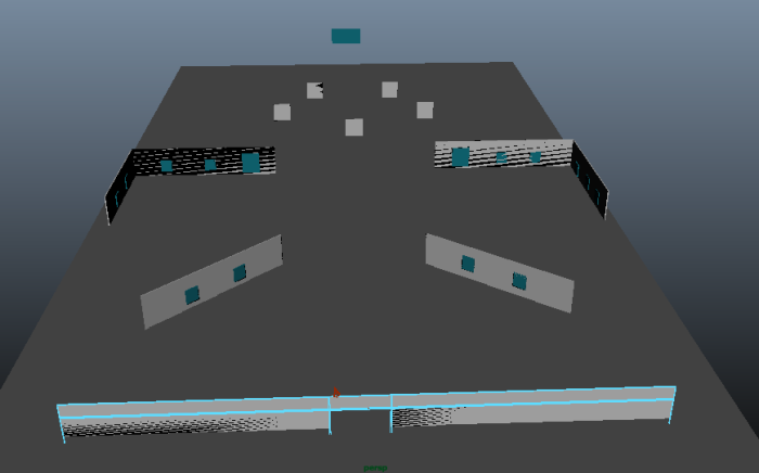
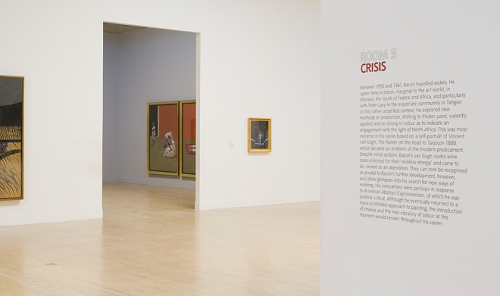
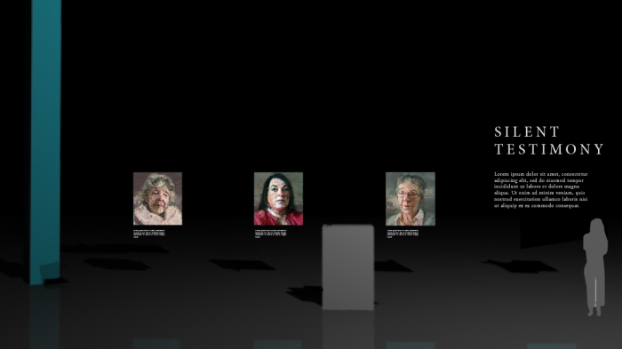
Below are a number of different set ups I drew up with my Maya images & Adobe Illustrator, to quickly get an idea of what feels right in the space. As the explorable is a large space with different themes of work to be displayed, it will need some sort of additional information to explain to the player what they are looking at. In creating a basic mock up I began to see the sizing that work and don’t work. I found that the text over or too close to the ‘images’ looks crowded and unprofessional. A better solution was to have the text to the side of the exhibition, and leaving the paintings to stand alone.
This slideshow requires JavaScript.
When looking at Colin Davidson’s exhibitions I saw that he didn’t have much text accompanying his work. This prompted me to try the layouts without text under the images, but only to the far side of them, leaving them completely alone. This layout worked most effectively as far as I could see, so we will take it forward into the larger design of the explorable.
Information display as the player moves
I drew up this idea of a possible information display through the space. Realsing that the player takes a while to walk between spaces, prompted me to think about that journey. Either we could change the spacial distances, or we could make the journey more interesting! This idea is a very rough concept, but there could be something interesting about spacial movement triggering audio or visual clips of information.
Navigation in VR
Similar to above, I started to think about how the player would navigate the space. If it’s a large empty area, then how will someone know where they are, or what is where? This concept demonstrates thin lines guiding the player with arrows to the different elements of the exhibition. I like the idea of a floor layout where the navigation doesn’t take up important visual retail space, but is obvious enough to be helpful when a player needs it.
Final Notes
These early concepts should act as a springboard for the next few days, as I work to develop the explorable layout in it’s entirety. I plan to look into signage in architectural spaces, architectural gallery design and game design to help aid these developments and guide the next stages of the design process.
This week I’ve been spending some time looking at the design on the explorable space. I find that it’s easy to get caught up on the more complex elements of an idea, and forget to give the more simple things attention. As UX Julie Zhou, writes,
When we design the middle, we tell an aspirational story, a North Star, to paint a picture of a future we want to see. The problem is that we often neglect to design the beginning until the very end. – Julie Zhou
We didn’t want this to happen for our gallery space; after all, this may be the only part of the experience that a participant explores! While the concept is simple (in that it doesn’t need animation), the actual space will need careful consideration in order to create a memorable experience. As far as I can see at this moment, there are a few key elements that will need attention for the explorable:
The spacial layout
Typography in the space
Navigation in the space
Audio in the space
Content of the space
Spacial Layout
I began to think about how the space could actually work by drawing out a few ideas that were in my mind I find it easier to sketch roughly in Photoshop and on paper to give me an idea of what works, with the idea to develop them later.
This slideshow requires JavaScript.
I began by thinking about how the participant could interact with the space. I immediately wanted to add walls to the space because it was what I was used to in a gallery so I challenged myself to think outside of the box. I questioned, what if light framed the space? What if by moving into an area the gallery of images appear around the viewer? What sort of materials will me use in the space? Would reflective surfaces add to it?
3D Exploration
Early tests involved achieving a reflective surface on the ground plane in mental ray, and using large incandescent tubes to light the space. I like the idea of light framing the gallery and guiding the participant through the space instead of physical objects. Below are a few early layouts that explore that idea.
This slideshow requires JavaScript.
Multiple Galleries
From this point I wanted to expand the gallery to see how multiple themes could work in the space. At this point I added a cube to show the scale of a person, to see how it’d feel from eye level.
This slideshow requires JavaScript.
I experimented with different layouts for different spaces, as we will have galleries with different collections of Colin’s work. Using placeholders for typography, I was able to get a sense of what the space could look like. I have not given much attention to the lighting of the space, and this is something that I’ll explore a little later.
This slideshow requires JavaScript.
Navigation
After playing with the layout, I began to test how a navigation may work if there were guidelines on the floor. They look absolutely horrendous right now, but I would like to develop the idea further over the next while. I like the idea of the navigation to be out of the immediate eye line, as I the main focus should be on the work.
This slideshow requires JavaScript.
Next Steps
I plan to use these layouts as a base to work from, and develop a few of the ideas. Next steps include testing out typography and further developing the navigation ideas. While it’s useful to get a sense of the space, I am not convinced by the current layouts so I’m going to continue to develop these over the next week.
After researching Colin’s work and creating the edit, Fiona and I wrote out along the window each element of the interview. We timed the whole thing, noting how long each part lasts, so that we could plan our animations around that.
We then conducted mini brainstorms around each element. In this, we broke down the core themes of the pieces of writing and thought up visuals to represent them. We made sure at this moment, to also think about transitions, as in virtual reality there are no cuts like in film.
This slideshow requires JavaScript.
After coming up with some really interesting ideas, Fiona and I split the project in two and storyboarded a section each. This is a challenge as in VR there’s a 360 view! We made the decision to create our dimensions 7680×1080 (1920×4). We decided to not storyboard the vertical action, simply for ease of viewing on our screens. Making it too big, made it hard to see any detail.
Storyboards
Transitions
There were going to be cuts in the sequences, so to ease this transition I thought it could be nice to have large paint strokes reflective of Colin’s style to float by the participant. Inspired by my early research of paint strokes, this idea could potentially be something that then carries through a number of the scenes.
Celebrities
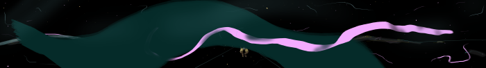
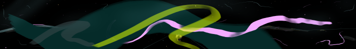
Planning these storyboards, we had liked the idea of celebrities being represented by the stars in the sky. After looking into some research, I thought that it may be interesting to have a northern lights type background, which slowly moves towards you. Colin has a thread that runs through his paintings about common humanity and these stars could come down and align with you. I tested a couple of iterations of this concept.
1
2
Human Beings as Equals
When thinking about the concept of human beings as equals, we thought that it may be good to be a little more literal. We did not want to saturate the piece with abstract concepts, so felt that at this time of the piece there should be a reference to frames. Colin talks about all o the paintings being the same size, so here we thought we could have a range of the frames appearing around the viewer.
Tomorrow, Fiona and I will share and connect our ideas together. This will then form the basis of the animatic which will be our reference for the timing through out the piece.
After some early iteration on the concepts and after creating the edit for Colin’s interview, we were finally at the stage where we could brainstorm for the interview part of our piece.
Before diving into the ideation, I took some time to really study Colin’s work. This was the largest piece of inspiration after all. I thought about how to reflect his style, how to reflect the words of the interview, and how to reflect the themes of his work.
I studied his use of colour by looking at a range of the different portraits. I then looked at how he used line and form in his pieces, the application of paint. I also looked at videos of how he paints; studying the process of how he builds up his drawings and paintings.
This research paired with the early ideas we had worked on will serve as a solid foundation to build up the animatic on. Having a strong sense of what Colin’s work is about from a technical perspective, will allow us to be much better informed in creating the animated visuals for the piece. In the next few days we will be developing the animatic.
Citations
Davidson, C. (2016) Colin Davidson – Home. Belfast: Colin Davidson. Available from: http://www.colindavidson.com/ [Accessed 02/05/2016].
Mood board from my Niice account influencing some colour choices and inspiration for the animatic. I like the idea of having a totally black background, with shoots of colour running throughout it. I’ve been looking at different paint styles, paint and multimedia blends as well as images of galaxies. The northern lights and star constellations have always fascinated me; these visuals could potentially lend themselves to the piece to give the participant a sense of spacial awareness.
This could be something to explore in both particle systems and in textures we create. What if the colours of the particles were picked from Colin’s paintings?
When we first began this project, we were not entirely sure what to call it. We considered referring to it as a “digital experience” or even an “interactive story”. When we began to break down the elements of the piece, however, we soon realised that it fitted best into the category of documentary film.
At first, I was unsure that we actually fit the medium of documentary film. Most documentaries I had seen were linear stories, and not very experimental. For our piece, we had planned on animating elements of what our subject said. We were filming the subject in 3D and placing him in a 3D environment in virtual reality. We had an explorable gallery planned, for the viewer to walk through digitally. In short, we were being very experimental and I questioned if the piece was fit for such a title.
Over time, I began to research the medium further and it was then that I came across an early definition of documentary film by John Grierson describing it as the “creative treatment of actuality”. When I read this, it rang true to our work; we were recalling parts of the story of Colin Davidson, his thoughts and feelings, and giving them a creative treatment; animating his words, but remaining very true to his values and the story he recalled as we sat down and interviewed him.
I did not want to justify myself with one singular viewpoint, so I continued to research the practice of documentary film. As I read through articles, books and watched videos, I began to see how diverse the medium really was. I came across numerous animated documentaries, such as Ryan by Chris Landreth(2005), a fascinating animated documentary of an artist, which goes beyond the level of experimentalism that we had been considering. As Nicholas (p20, 2007) writes,
“Documentary has never been only one thing. For now we can use this history of a changing sense of what counts as documentary, as a sign of the variable, open ended, dynamic quality of the form itself.”
What is interesting about what Nicholas writes, is the fact that documentary practice is ever evolving and ever changing. Of course there are certain elements of documentary film which are common practice such as interviews, reenactments and archival footage, but the medium itself is open to change and innovation. For me, creating this piece with this in mind, is really quite exciting. Virtual reality is a new medium which is very much in its early development. To pair something so new with a well established practice, leaves room for us to be truely original in the space of documentary filmmaking. As Nicholas (p13, 2007) writes,
“Documentary films stand for a particular view of the world, one we may never have encountered before even if the factual aspects of this world are familiar to us.”
In our piece I hope to give participants a view of a world, as Nicolas writes, that many have never encountered through the story of Colin Davidson. In addition to this, I hope to give them a view of documentary film in a way that they have never encountered it before. While we will have elements of documentary film, through archival photographs in our explorable gallery and an interview, I will be striving to create an original experience to end my degree with.
Citations
Ryan (2005) Video. Directed by Landreth, C. National Film Board Of Canada.
Nicholas, B. (2007) Introduction To Documentary. In: Anon.Introduction To Documentary. 2nd ed. Indiana University Press, 13-20.
With Colin’s Interview only three days away, we chose to spend this morning planning out our interview in more depth. Fiona and I had previously put together a range of questions that could potentially be asked, but we knew that they needed a little more refinement and structure.
One of my core areas of research into documentary film was how to construct a narrative. I struggled with getting my head around how to construct a story when you don’t know what the content will be. Previously when we had our interview planned, and all we could do was guess what Colin was going to say. By looking at a number of documentary stories as well as documentary theory, my mind began to piece together how to approach our piece.
Structure
On researching documentary structure I came across a number of great websites with a range of tips and rules to live by in documentary film. One of the main things that came up was the creation of a story arc. Where this may seem obvious, it’s difficult to plan what this may be when the content is unknown! Traditionally this is done in three parts, through a beginning, a middle and an end and is also referred to as a dramatic structure. Like Volgler’s writer’s journey, Morgan Parr writes,
“The beginning introduces the character(s) and establishes their goal(s). The middle, or second act, is the character(s) struggling to accomplish these goals and the obstacles that stand in their way, ending in the climax, which shows if they accomplished their goals or not. Act three – the end, resolution or conclusion – shows the growth or change of the character(s) due to the journey.”
Emotion
We do not want to simply collect information about Colin when we interview him, we want to connect with him and hear his views, his stories and his struggles as an artist. Conducting a meaningful interview, rather than a purely factual one was important to us. Going beyond the small talk is what makes us connect with other human beings, and with an aim of only three minutes of interview, we wanted to capture some emotional content. As Parr comments,
“Another part of the story to think about in story development is the emotional center. All good documentaries have it. You want your audience to relate, empathize and care about someone in the work….Unlike in narrative script development, you are not making these characteristics up. Instead, you are looking to identify them and to show them to the viewer”
Indeed, when we were planning we wanted to do our best to bring out a side to Colin that is really true to himself; not just to capture his character for his own sake, but for the viewer too.
Planning With Intent
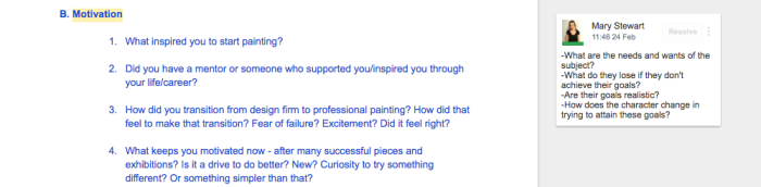
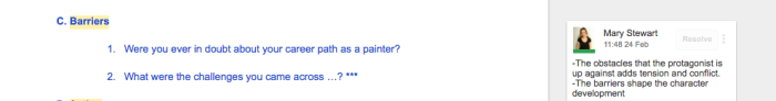
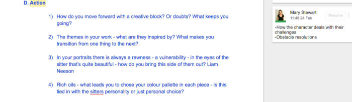
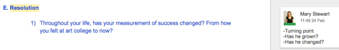
I shared some of my research with the girls, including a range of notes I’d made over the weeks on different structure styles. We choose to go with a five prong approach covering five main areas of the story arc: Introduction, Motivation, Barriers, Action and Resolution.
In addition to this, we discussed and decided on our main thread which we were studying in the interview which was “Finding your purpose and passion or a Path to purpose.”
From here, we began to break down what questions we had, and added to them to fit the story arc. We eliminated what we felt was too much to save time, and collected the general goals of each section that I had collected from previous research. The questions were as follows:
Introduction
Motivation
Barriers
Action
Resolution
Inspiration
I took time to look at how others are doing more creative interview pieces such as Chris Landreith’s “Ryan”, NY Times’ “Modern Love” and Jeremy Cox’s, “Paul Rand Retrospective”. Three extremely different pieces, both in content and delivery, but a common thread that runs through them all is the emotional connection that you can have with the interviewee.
With Ryan, the viewer is brought into Ryan’s mind, as crazy as it may be, and feels an element of empathy in knowing what’s effecting his actions. In another way, Modern Love shares a beautiful story of love and loss through one girl’s narrative. The intimate telling of her story brings the viewer in to her world, using simple line drawings, sound and animation to add to the emotional effectiveness of the piece. In a completely different way, Paul Rand shares his lessons on design, talking about how without passion and connection with people, the work is never as good. Through rhythmic animation matching the graphic style of Paul Rand, the viewer connects with the piece through the content Paul Rand talks about in the video.
With this research in mind, moving forward, we will do all that we can to conduct a natural and meaningful interview with Colin. In the editing stage this research will play a big role, as we work to form a meaningful edit around the theme, “Finding your purpose and passion or a Path to purpose.”
Ryan – by Chris Landreth
Modern Love – Nick Van Der Kolk for the New York Times
I’ve been thinking about how to best set up of the interview space. We know we’re going to have three cameras, a large MAC in the corner as well as an audio controller. Bearing in mind that my kitchen is not that big, this could be overwhelming for Colin, and we want to make sure that we set up an atmosphere that makes him as comfortable as possible.
One simple way to make him feel comfortable is by listening really well. I am going to be the one conducting the interview, so I want to make sure that I can feel distraction free to give Colin my full attention. By taking the time to look Colin in the eye, show him that I am listening, the conversation should feel natural, and my attentiveness should draw his attention away from the four cameras in his face.
Another piece of advice I read on documentary interviews was to plan the eyeline. The reason? The further the eyes go from the camera, the more distant the viewer feels from the interviewee after the interview has taken place. On the basis of this, we decided that I would sit beside the main depthkit camera to have a more intimate interview.
Over the last few weeks I’ve spent some time to research documentary filmmaking practices. I was interested in how an interviewer prepares before interviewing a subject, to inform how we structure our questions. We sifted through a range of advice, and decided to act upon a few of the opinions which were the most popular amongst credible sources. Below explains how some of this research has affected our preparation:
1.
Let the subject know a little about the interview in advance, but many have suggested to not give the interviewee the questions before the day (CITE).
In response to this, I emailed Colin at the beginning of the week to explain a little more about the project, and gave him an idea of the themes we are going to be taking about. We chose not to give him our questions because many have reported that providing too much information in advance, causes the subjects to prepare too much, and often appear unnatural in the interview. We did not want to loose this spontaneity with Colin.
2.
Ease the subject into the interview with easy questions.
We choose some commonly asked questions in our opening, to allow Colin time to feel comfortable in front of the camera. Colin has a slight speech impediment so we have been very mindful in creating a relaxed environment, which encourages a colloquial tone. As the interview progresses, the questions become deeper and more meaningful.
3.
Ask questions that are open, rather than what can be answered with a yes or a no.
We were intentional about creating opportunities for Colin to speak naturally about his work and practice. As this is an indirect interview (our edit will not feature any of the interviewer’s questions), we hope to be able to collect a range of answers which stand on their own without the support of questions or prompts.
4. Prepare and research. Lots.
In every single article I read, preparation was of core importance. A well researched subject equips the interviewer with the most appropriate material to discuss, bringing out the best answers from the subject. We had spent a number of weeks researching Colin’s work and his life, and this week we decided to focus on this even more. We all spent time to read and share about his work, the themes of his work, and the inspiration for his work. Not only will this give us the chance to bring up these findings in our questions, but it also shows a level of professionalism and respect for Colin, which I believe is important to communicate.
In nearly all of the pieces that we have come across to date, sound has played a huge role in enhancing the experience for the viewer. We wanted to make sure that we were thinking about sound from the get go so that it is fully integrated into our piece and not a last minute thought. There are multiple levels of sound that we will explore, from atmospheric ambient sounds to smaller sound effects which are reactive to user interactions.
Location Matters
This piece is going to be first showcased at the UUB end of year degree show, where there will be hundreds of people passing through the building. The opening night promises to be a jam-packed evening – which means lots of distractions, both visually and audibly. The nature of VR is immersive; the participant is placed in the middle of the scene as soon as they put on the Oculus headset. While the visuals inside the headset immediately bring them into this new space, without audio doing the same, it will be a distraction that will easily take them out of the moment. We hope to find a complimentary mix of audio that will enhance the overall experience for the participant.
Ambience
I’ve started to do a bit of research into the sort of track we would like as a back drop for the experience.
Tone
I could imagine having something like this piece in our explorable scene where the user can move around. We want the atmosphere to be calming and uplifting but not overwhelming – this piece is quite a good balance of that. On the other hand, it’s maybe a little too “spa-like” for us.
This track has a constant whitenoise effect which could be a nice backdrop for the interview we create. It’s important to not have anything too distracting, but to maintain a relaxed atmosphere in the space.
This track doesn’t have much going on, with a constant drone throughout. We may end up using something like this as a base which we layer other sounds upon.
This track is more melodic, with piano notes throughout. While I don’t think it’s the right track for us, it has made me think that there could be a place for a more piano based sound in our introduction. With floating particles as part of our visual experience, it may be interesting to have light staccato notes to reflect their presence in the scene.
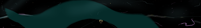
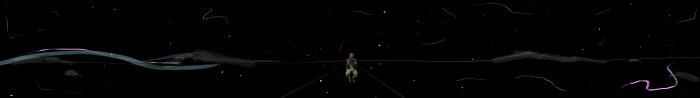
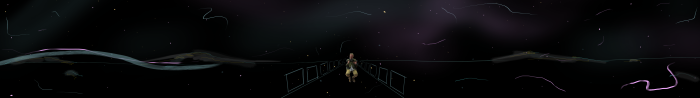
After our previous concept ideas weren’t quite working, Fiona and I went off and tried some new approaches. After looking at set design and various other virtual reality experiences, it allowed me to think more about a 360 experience – where the participant would be and how we could create visuals for that.
As a team we made the decision to create the work upon a dark background. This decision was based upon a few elements. Firstly black gives the feeling of perspective and depth, which makes a lot of sense for Virtual Reality. In addition, when designing for a gallery of art or photography, black or gray backgrounds help to make the other colors stand out, contrasting well with bright colors. With Colin’s think oil paints in mind, this seemed to make sense.
Colour psychology suggests that black is associated with mystery, an idea that ties in well with our concept targeted at graduating students. The transition from university and into the “real world” is full of mystery, with the many of people leaving with uncertain next steps. In a sense, we’re inviting participants to step out from their own unknowns and into another to hear Colin’s story.
Developing Concepts
I started my new concepts with this in mind and began by doing a few more drawings to get some ideas out of my head. These were done with possible themes in mind such as self doubt, conversations on his work and growing up as an artist.
Participant as a light
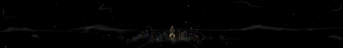
I had watched a fantastic interview by Colin Davidson where he was asked about self doubt in his work – if he ever questioned himself or felt that he was the right path. He responded by firstly saying yes, but then continued to speak about the world of art. He spoke about how art was full of questions, and as a viewer, you never want all of the information – you want to be able to interpret what you see. Similarly in his life, he has grown to realise that he never has all the answers and as he’s grown as an artist, he’s become comfortable with that. In response to this idea, I thought it may be an interesting idea to make the participant a light source and as they move their head in the Oculus, the lights could shine around the space potentially revealing objects in the scene.
Ribbons of paint
With painting at the core of this project, it would be lovely to incorporate it into the setting. I love the idea of having brush strokes animating through a 3D space, that the viewer gets surrounded by. The Nike – Paint With Your Feet project has some beautiful visuals of how these strokes could be made digital, and I’d love to incorporate this into our piece.
Nike – Paint with your feet
Layered paintings
Another theme that I thought may appear in our interview is how Colin’s upbringing influenced him. Colin’s father, Rowland Davidson is a successful Irish artist so it’s very likely that he was always exposed to art as he grew up. I began to imagine how this development progressed, potentially through layering paints to create final images.
These concepts are all based on themes I expect to appear in the interview, and they can all be adapted to the themes we hear. Their main purpose was to think about how to illustrate ideas spoken about in the interview while Colin is talking.
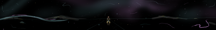
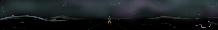
Imagining the setup of the experience
We decided to start to think about the space in 3D, focusing on how the scenes are set up. We moved to Maya, exploring how light and space could create depth in the environment. Fiona began to focus on the interview scene and how that may look, and I focused on the introduction and the explorable space. As I mentioned previously, the experience is broken into three sections – an introduction, an interview and an explorable space.
Developing the Introduction
We decided that it would be important to include an introduction for a number of reasons. Firstly, it helps the participant have an idea of what’s to come and expose them to the world they’ve been placed within. Secondly, from our research with into virtual reality experiences , we’ve learned that it’s important to create a 30second “settling in” period, where the user can adjust to the environment.
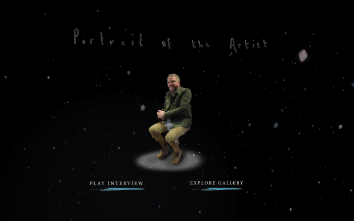
With this in mind, we thought an open space with a particle filled environment, and a short text intro may be a good way to ease the participant into the experience. As well as the text and particles, there will be a image from the DepthKit in the distance to introduce the participant to the interview. When the participant presses PLAY, they will zoom into this image to begin the interview section. We wanted to keep these elements the only parts of the introduction, to remove distractions and whet the participant’s appetite to see more.
Typography
While this is an original piece, the content is driven by Colin Davidson’s story and I think it’s important to “brand” it in lieu of how he presents his work currently. In a way, this piece will be a gallery of his work with an insight into his process, so it is important to respect his work as you would in an exhibition. With this in mind, I took a look into the typography and set ups of his recent galleries, to see how it could influence our piece.
His work is branded with elegant serif fonts, using size and colour to create hierarchies. Supporting text uses complimentary sans serif fonts.
For our piece I tried a few experiments, and decided to go with Minion Pro for our titles and Adobe Garamond Pro for the subtitles. I wanted to create the same classic, elegant look which Colin uses to introduce his work. The PLAY button is Gotham HTF, chosen because of the serif texts Colin uses, but also because it is a button so I wanted to create a difference between non interactive and interactive text.
First Iteration
With particles…
Creating the Explorable environment
We also began to think about the explorable environment and how we could design this in a way that was engaging and complimentary to the interview. From our research into documentary filmmaking, we know that there is a range of archival footage that supports the stories. We thought that it may be interesting to have our explorable environment with a range of pieces and moments that Colin refers to in our interview.
While we were thinking about this, Nicole was testing how the Oculus integrates with Unity and how scaling would work. As a test, she brought a range of the paintings into the scene to look around. While we were looking at this, we began to see how effective a simple set up was in this context. It was incredibly effective when you put the headset on – the work really spoke for itself.
While we were all testing visuals, we bounced our ideas about with each test to inform each other’s work. I began to try a few simple Maya tests, using light to guide the user around the environment.
Early Mock Ups
Step 1
Step 2
I started to adjust the scene to form a set up that I thought would work well in the space. It was hard to tell with so little detail so I then added some images to give a better sense of what it would feel like. I added a still from a DepthKit interview to see how it could look in the space.
Step 3
The scene started to take shape a little more here, but the light wasn’t quite right. I then adjusted how the light appeared on the paintings, creating more depth in the space. We thought that a floating torso was a bit strange, so I took a photo of one of Fiona’s sketches of a man sitting down and added some painty details and shading to it to make it fit in the space.
Without light Changes
With light changes
Step 4
Finally I added some text to the piece to better illustrate the participant experience; as a participant approaches a piece, they can read or further details on it.
Bringing it all together
Introduction
Interview
Explorable Environment
This is all shared on our presentation which can be found here.
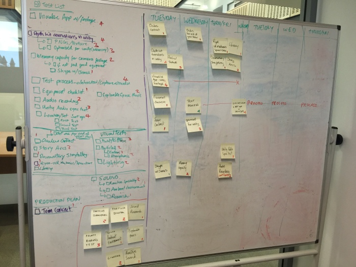
We’ve secured our interview with Colin so this morning we set out to plan the two weeks leading up to it. From our last semester, we recognised that we work well with a little bit of pressure that come from hard deadlines. In lieu of this, we began to plan towards the interview with Colin Davidson which is taking place on Friday February 26th.
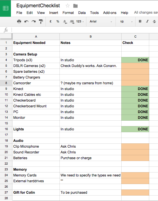
Using elements from the scrum methodogy (I know you’re meant to not break the scrum rules but it works for us), we created a large backlog of pieces of work we needed to complete before our interview. The pieces were then ranked 1-4 according to their level of complexity, and placed in our rough weekly calendar. For the elements that don’t have specific deadlines we’ve kept to the side to be picked up when we have time or need a break from difficult tests.
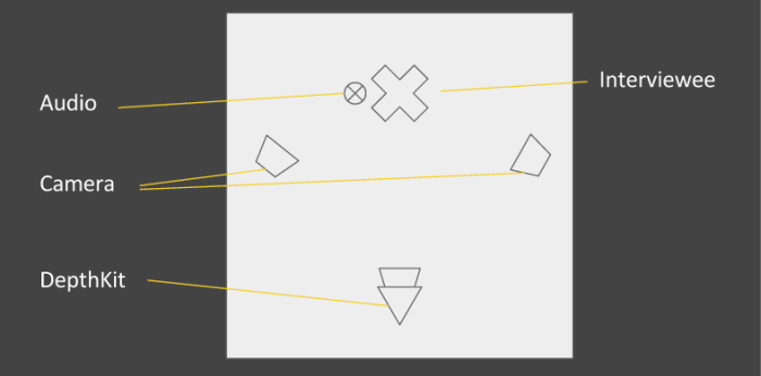
I broke off and began to plan the equipment that we will need on the day of filming. I based the planning around the setup that we hope to have on the day. We are planning to have three cameras – two to record Colin and one for the depthkit to record the RGBD video which will be connected to the PC and Kinect. We want to make sure that we have backup footage incase anything goes wrong, so the two additional cameras will give us something to work with, just incase.
There a few unknowns that we currently have, so it’s important to flag these now to give us enough time to find answers and solutions to these potential problems.
One of the challenges that I’m going to look into is the DSLR’s ability to capture large amounts of footage. I know that there are currently limits of 20mins per recording on the DSLR camera we are using, but we have experienced the camera stopping recording after only a number of seconds. This is something that I am going to explore over the next few days. I am pretty sure it has something to do with memory cards, but if it’s a problem greater than that, we will require a different camera which will need testing with the depthkit. By planning 2 weeks in advance, we should have enough time to figure this out!